Legal teams re-key the same company and counterparty details into every contract. I designed Lexagle's Master Data Management module — master tables that hold reference data once and feed it into contracts — end-to-end, from creating a table to managing records at scale.
Lexagle is a contract lifecycle management (CLM) platform for legal teams across Asia. The same entities — companies, counterparties, registration numbers — appear across hundreds of contracts. Master Data Management gives teams a place to hold that reference data in structured "master tables," maintain it once, and connect it to contracts, so the data is entered a single time and reused everywhere it's needed.
Without a master source, every contract meant re-typing the same company names, registration numbers, and entity details by hand. It was slow, and worse, it was inconsistent — the same counterparty spelled three different ways across three contracts. That inconsistency quietly undermines trust in the repository and makes reporting unreliable. The job was to give legal teams one authoritative, reusable source for their reference data.
I designed the MDM experience end-to-end across three build phases — from getting data in, to maintaining it, to connecting it back into contracts. Each phase lowered a different barrier to adoption.
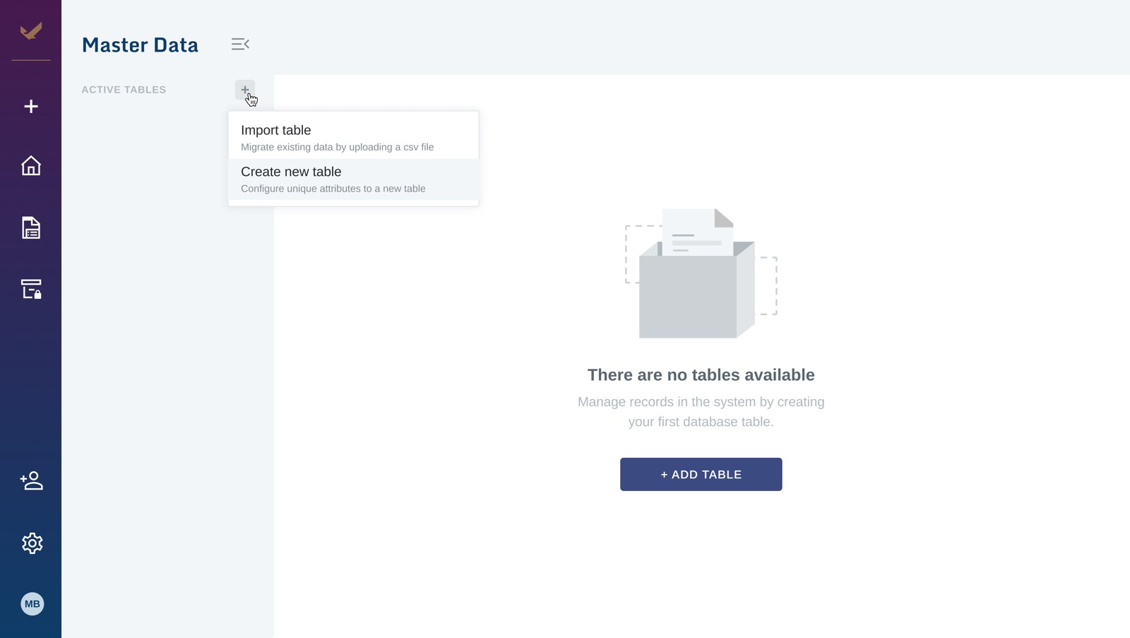
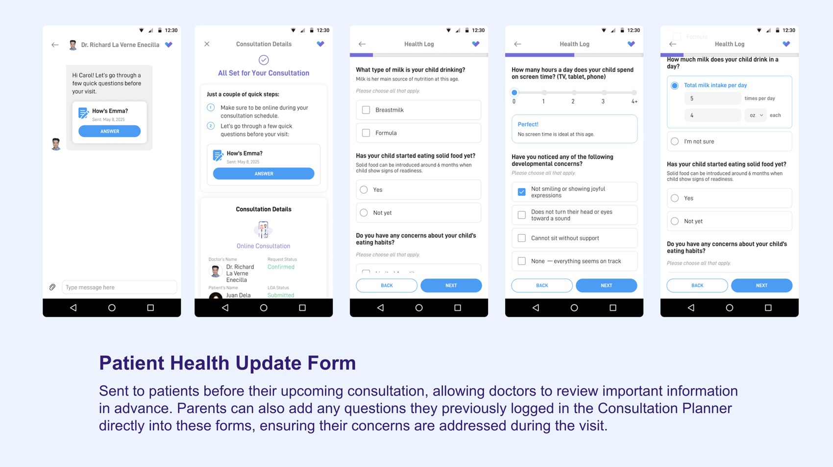
Rather than force teams to build tables row by row, the create flow imports an existing CSV and maps its columns — so they start from the data they already have.
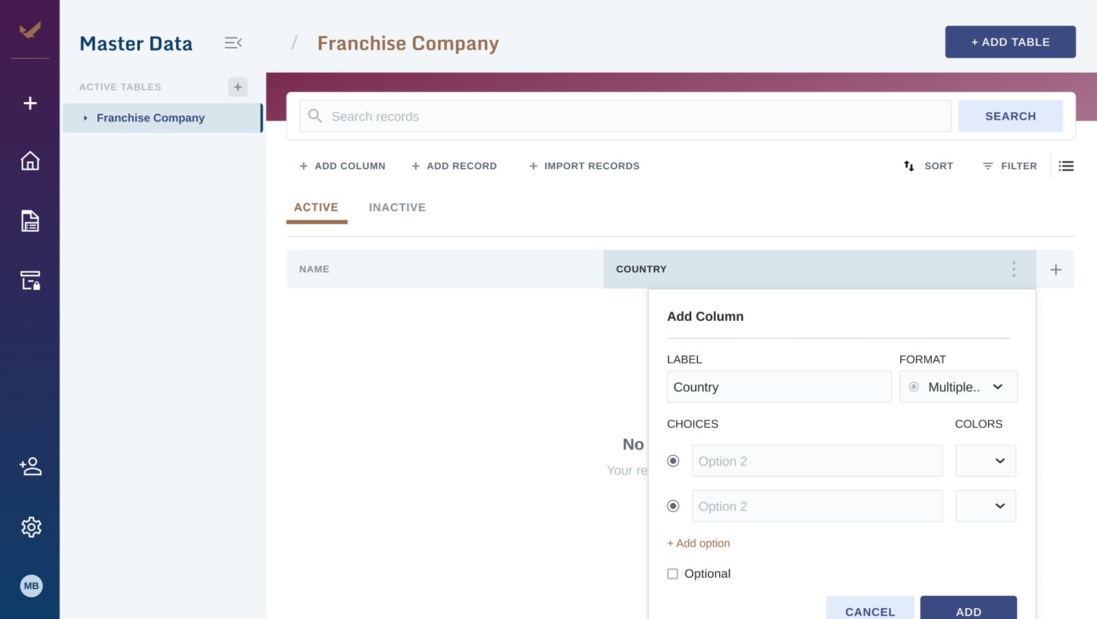
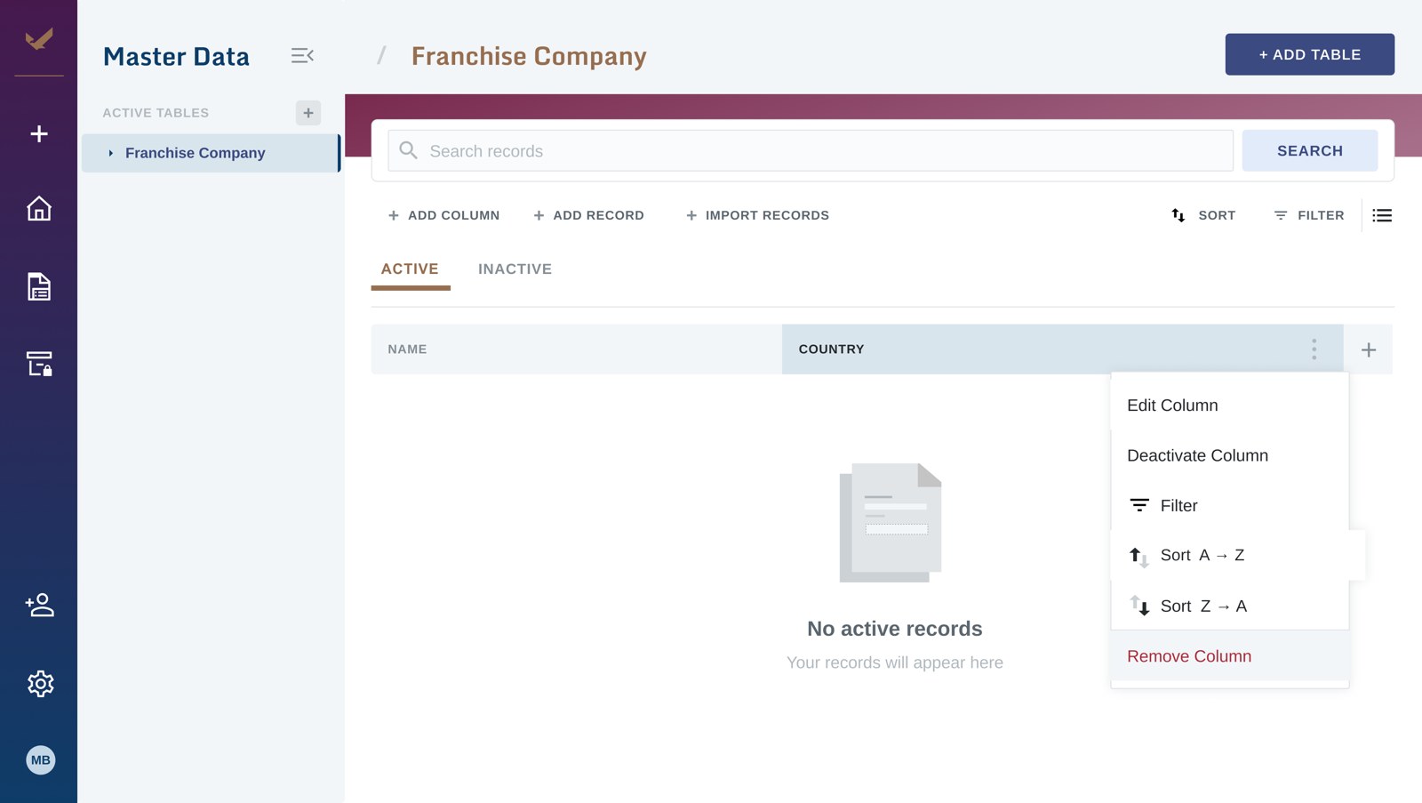
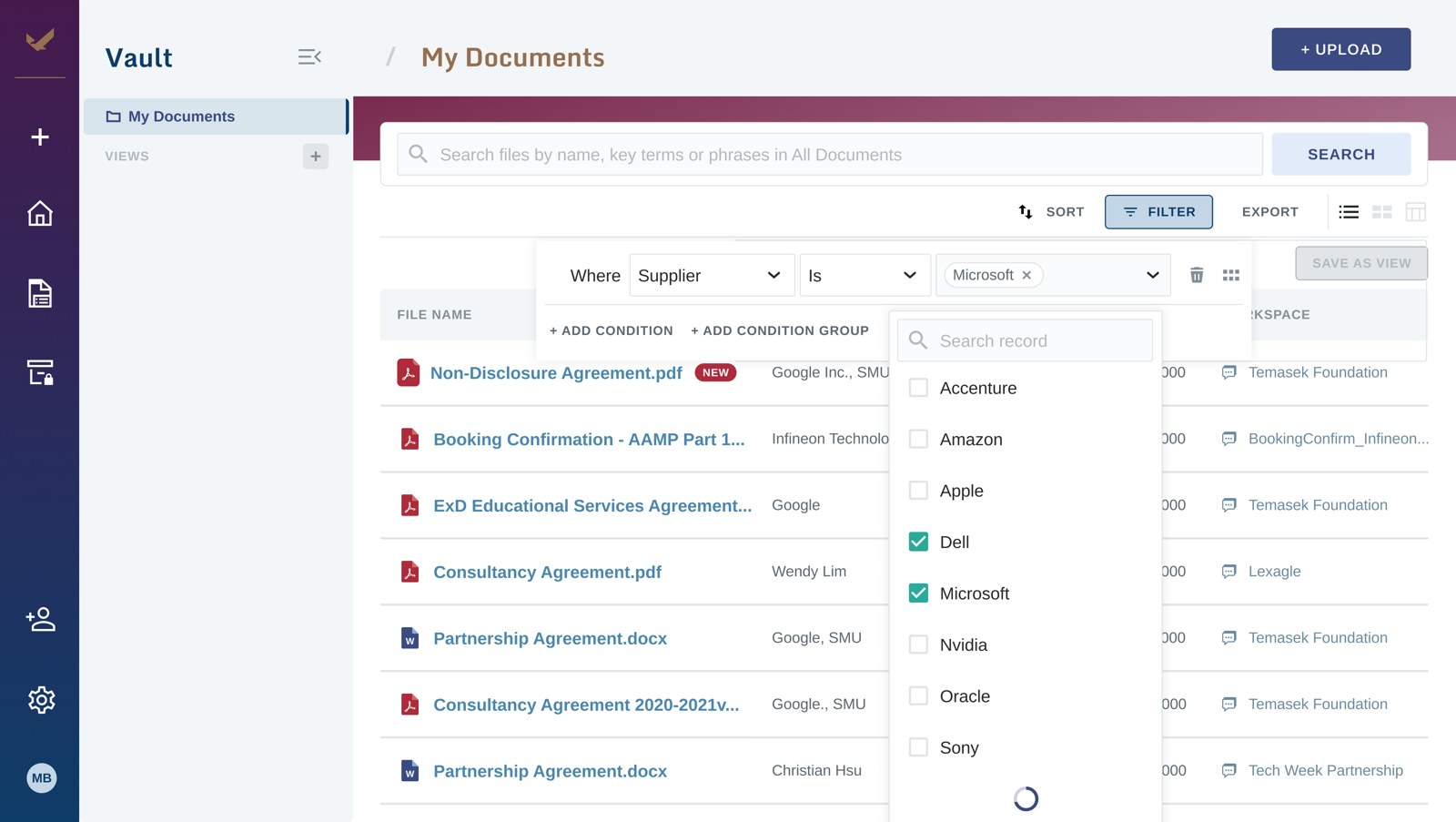
AdoptionA dense but scannable data table with search, sort, and filter, plus inline record-adding — the single source of truth, designed for enterprise data volumes.
Data densityThe payoff: master records link into contract fields, so a counterparty is entered once in the table and flows into every contract that references it.
Systems thinkingA walk through the core flow — getting data in, shaping it, managing it, and finding it.
1

2
3
1
2
3
1
2
3
1
2
3
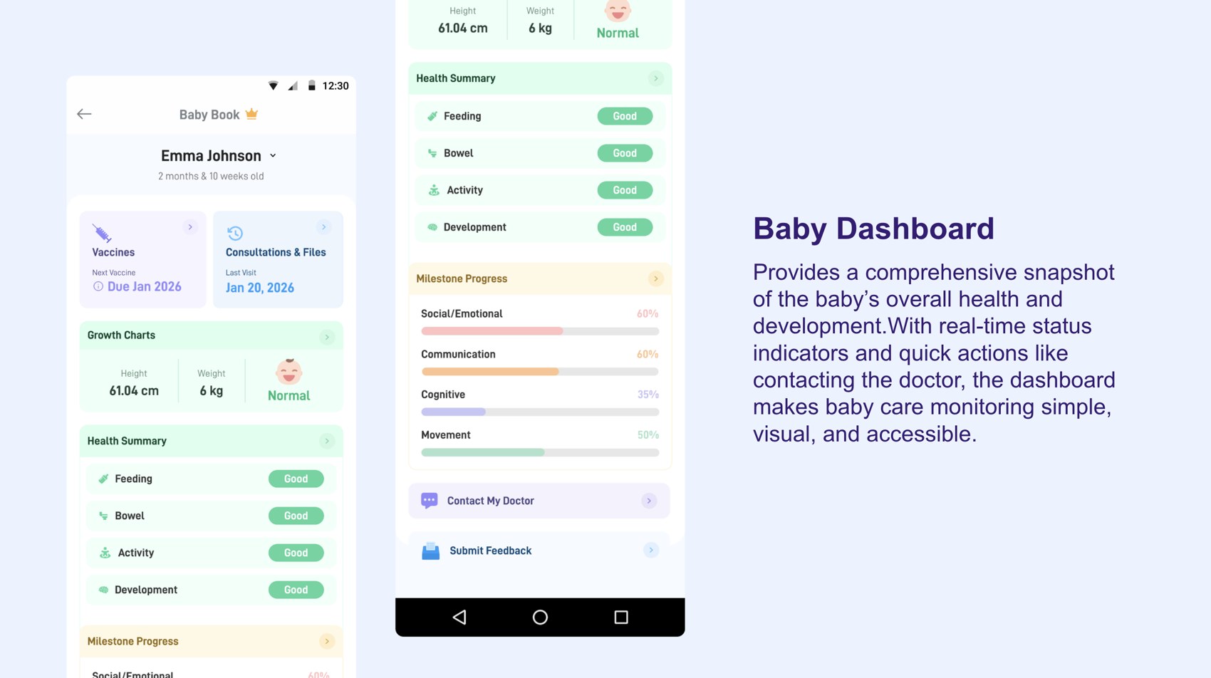
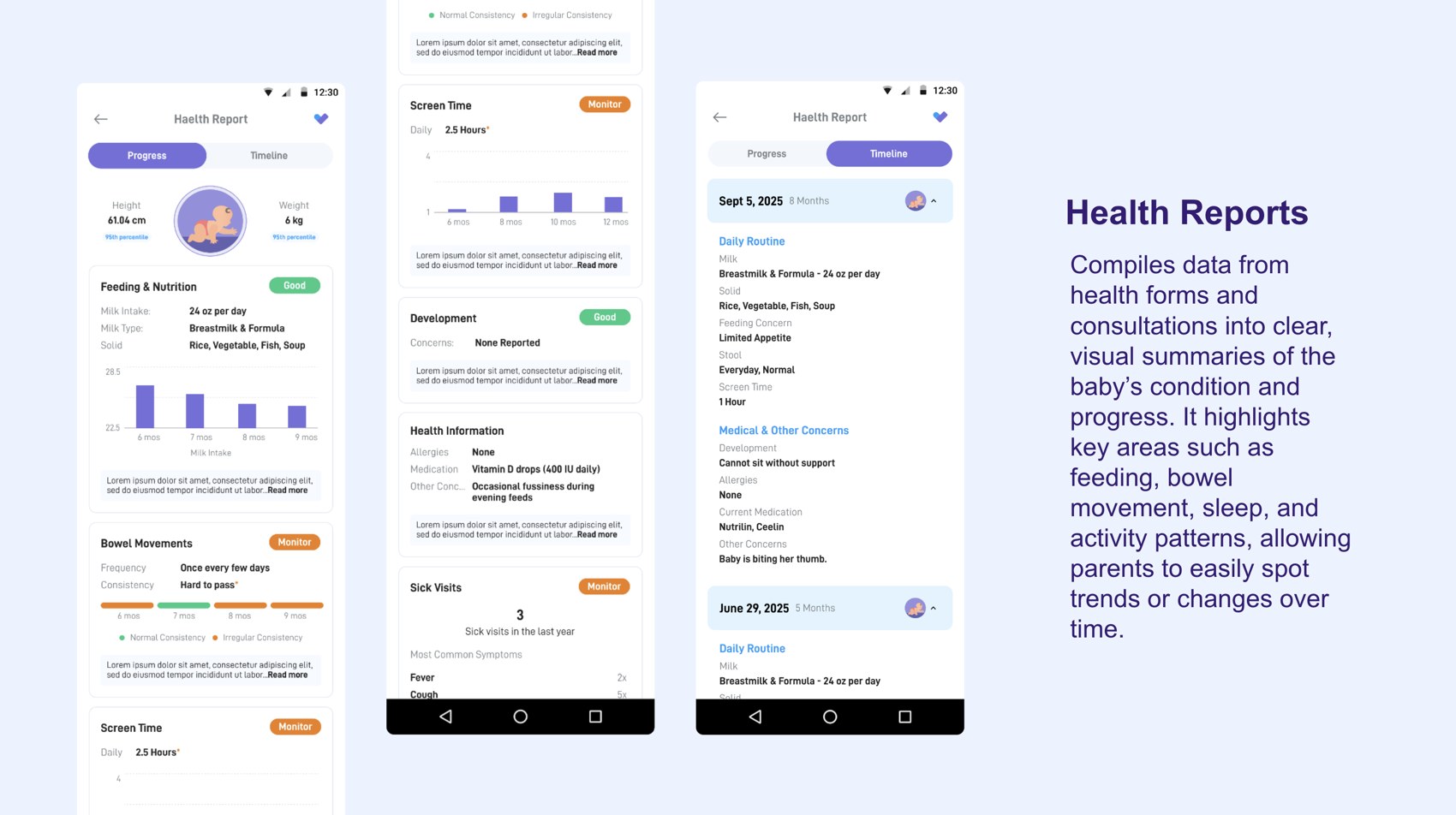
A digital baby book built into SeriousMD's NowServing app — giving parents one trusted home for their child's growth, consultations, prescriptions, and records, synced directly from their pediatrician.
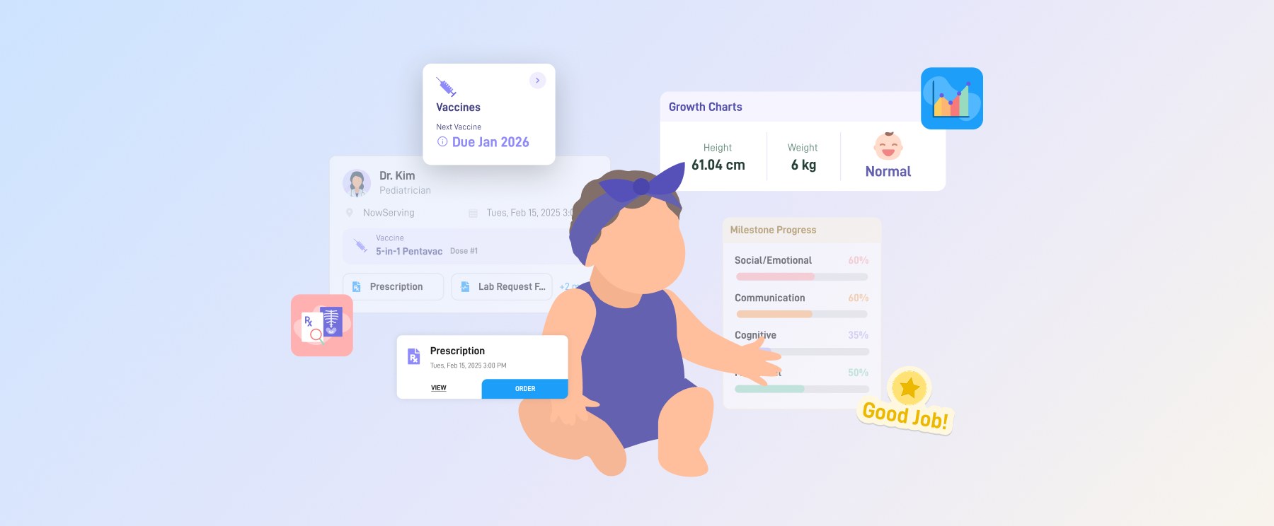
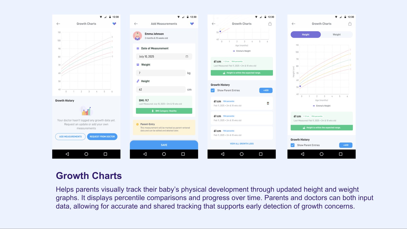
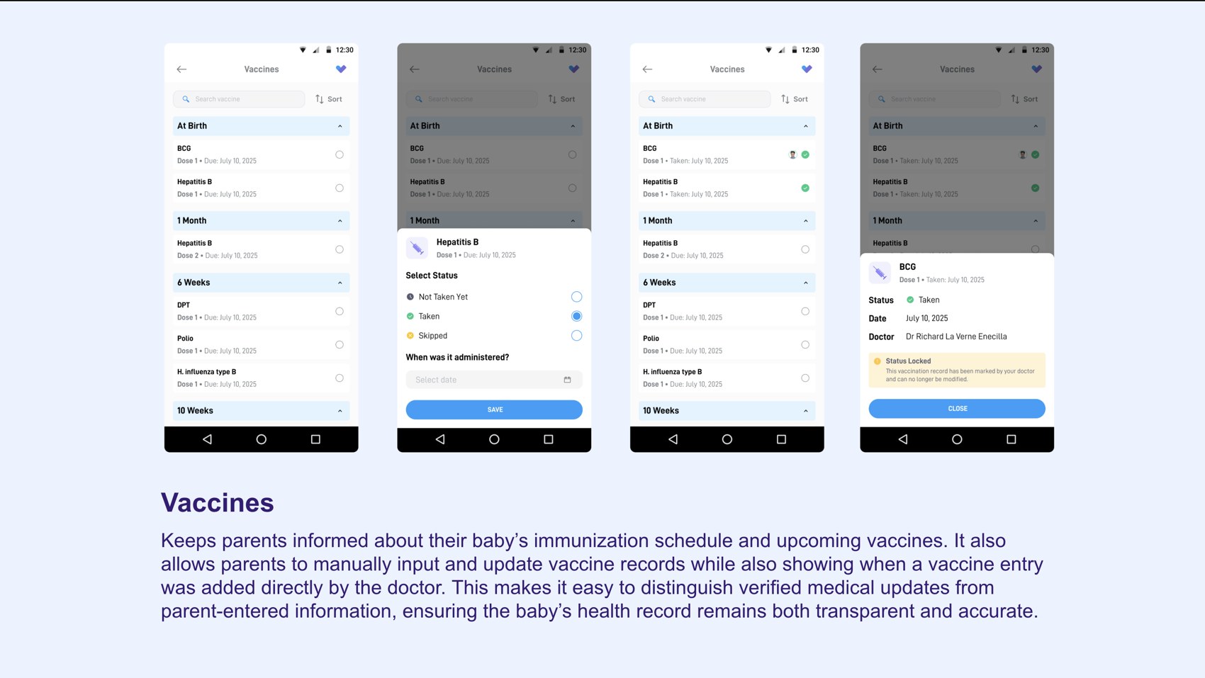
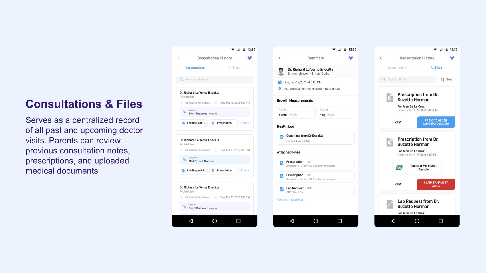
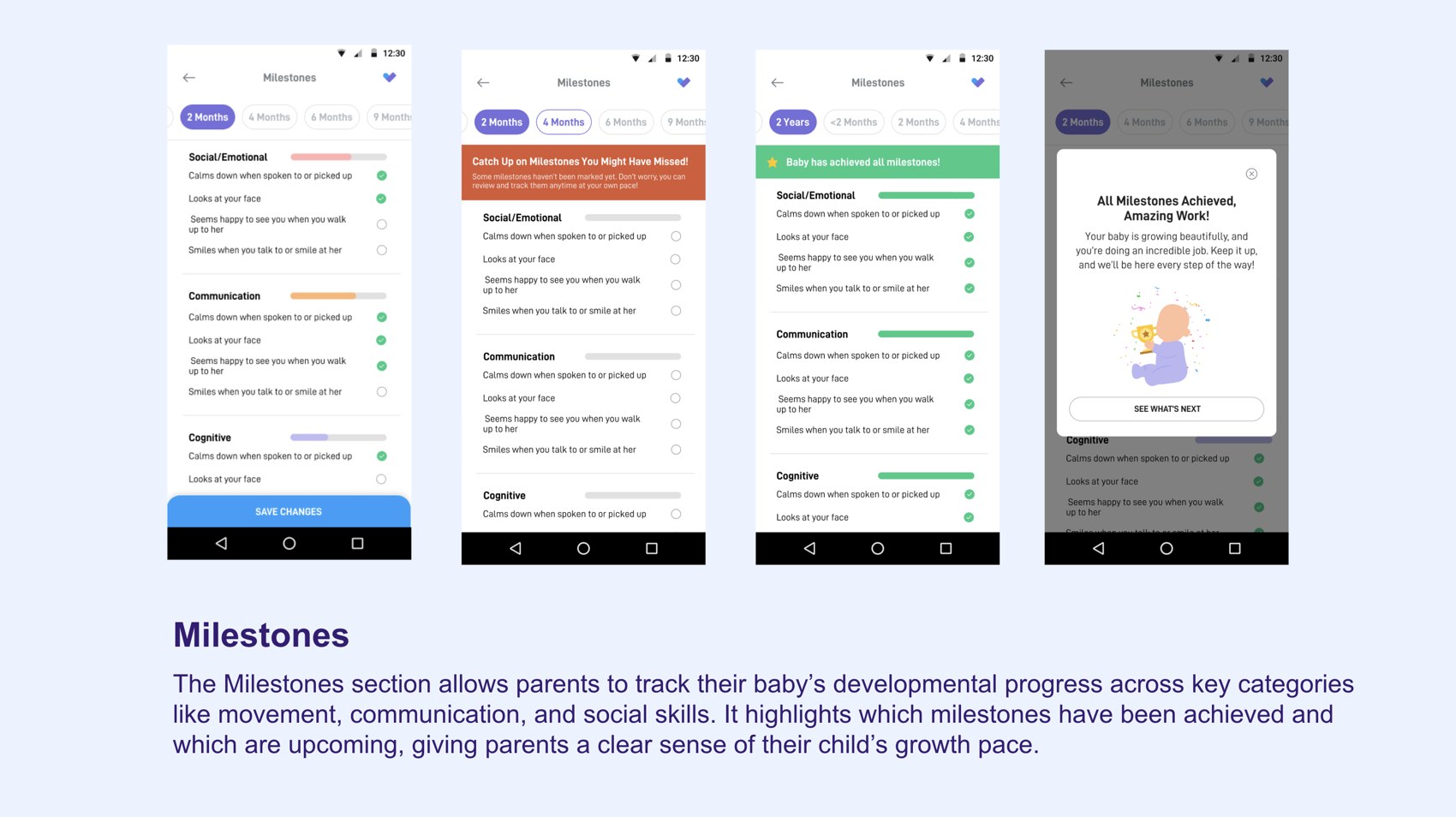
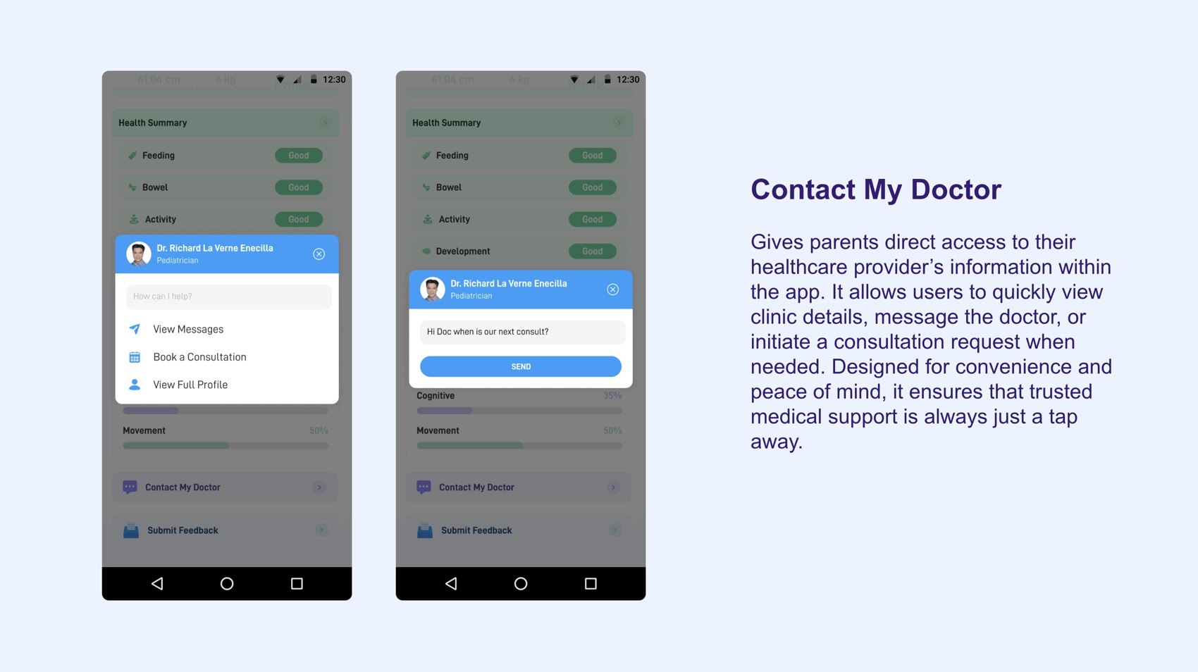
SeriousMD powers clinics across the Philippines, and its patient app, NowServing, is where families book and attend doctor visits. BabyBook is a dedicated space inside NowServing for a child's health journey — a personalised dashboard of the child's health, growth charts against WHO percentiles, an immunization record that flags which entries a doctor verified, milestone tracking, health reports, and a full history of consultations, prescriptions, and lab requests. Because it plugs into the same records the pediatrician uses, parents and doctors share one source of truth — and parents never have to re-enter clinical data.
Between paper immunization cards, printed prescriptions, lab results from different providers, and half-remembered advice from the last visit, a child's health record lives in a dozen places — and none of them talk to each other. Parents carry the anxiety of the gaps, and continuity of care suffers when history can't travel with the child. The goal: give parents a calm, trustworthy home for their child's health that stays in sync with their doctor.
I designed the BabyBook experience end-to-end within NowServing — the dashboard, growth charts, immunization record, consultation history, records, and the empty states a brand-new baby book starts from. The guiding principle throughout: reduce cognitive load and anxiety. Lead with reassurance and the next step, keep medical information legible at a glance, and let the doctor's records do the data entry.
Lead with reassurance and what to do next — the last consultation, the upcoming visit — rather than raw medical data.
Information hierarchyGrowth measurements, prescriptions, and lab requests sync straight from the pediatrician's records, so parents never re-key clinical data.
Systems thinkingA brand-new baby book has no data. "No growth values" and "No files yet" are designed to feel like the start of a story, not a dead end.
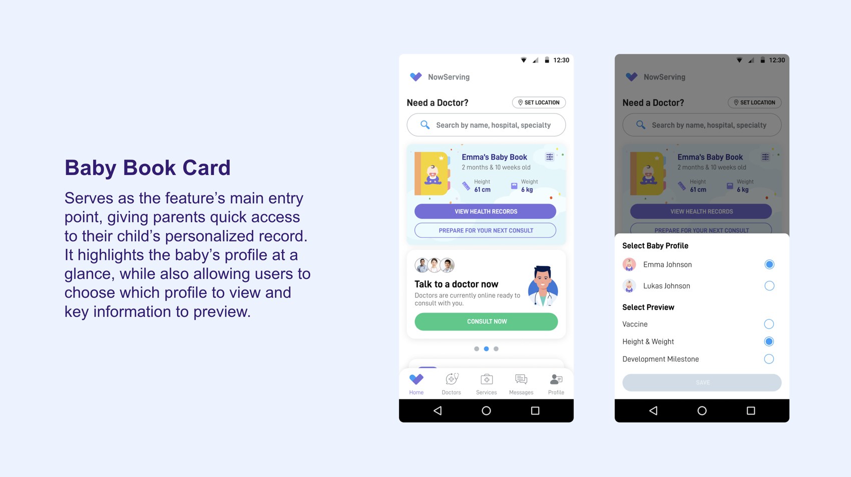
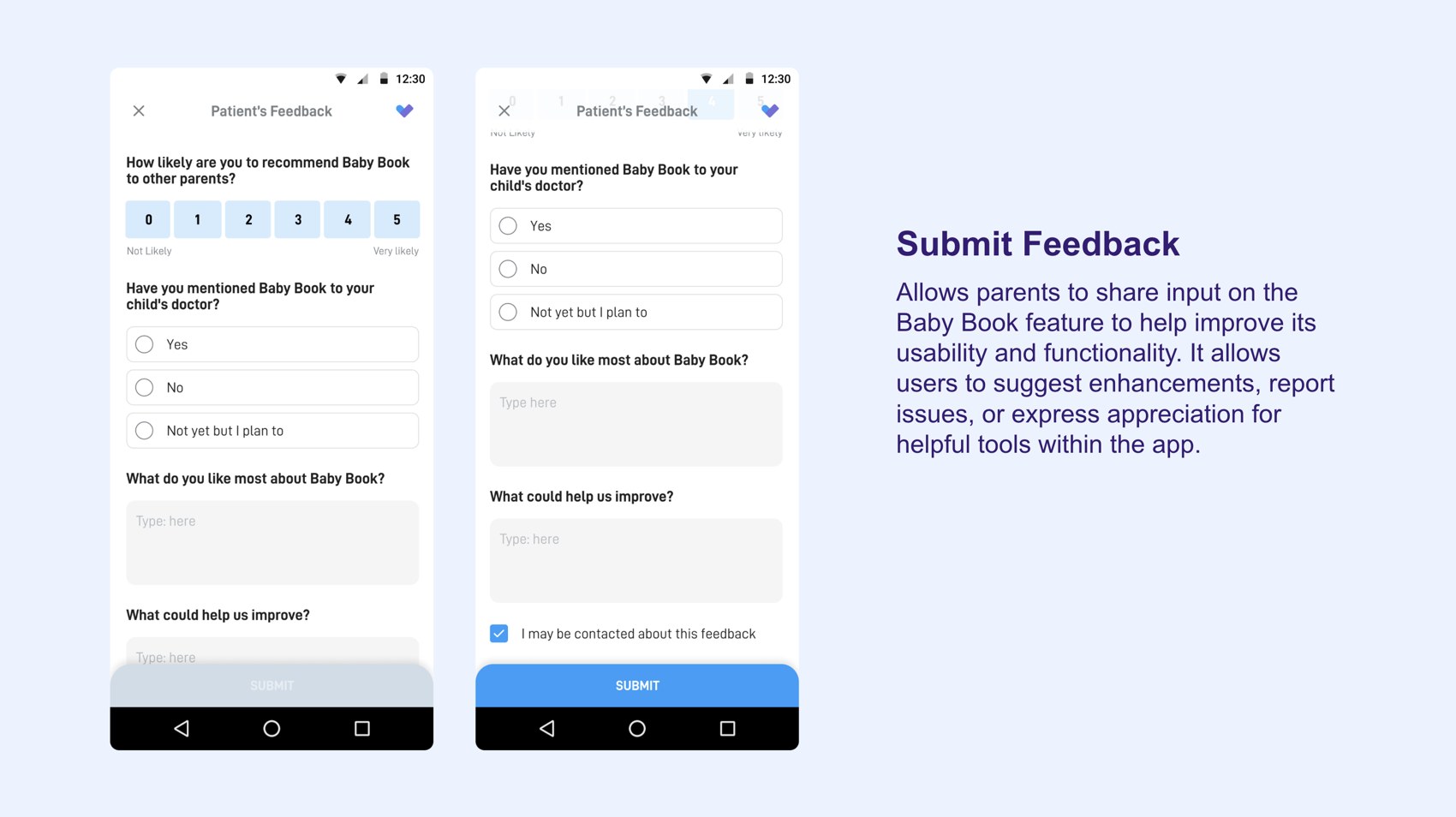
Edge-case empathyEvery surface of BabyBook, straight from the design deck — one calm home for a child's health.
Scent is a home-care brand's strongest asset — but on Purdy & Figg's Spring landing page it lived below the buybox, out of sight at the moment of decision. I researched, redesigned, and live A/B-tested a new scent-discovery experience (PF611).
Scents are a primary purchase driver for Purdy & Figg — but the scent-discovery block sat below the buybox, outside the initial mobile viewport. When shoppers switched between products, the scent details updated below the fold, where they'd never see them. The result was a broken cause-and-effect: "I selected this product" never connected to "these are its scents," weakening product understanding and confidence right where it mattered most.
Heatmaps and session recordings told a consistent story: engagement clustered tightly on the buybox product-selection cards, then fell off a cliff inside the scent block — most elements under 0.30%. Users simply weren't scrolling down to validate a scent change they couldn't see. Three problems stood out.
The scent block sat below the buybox, outside the initial mobile viewport — it required a deliberate scroll to reach.
PlacementScent content updated on selection, but the change happened off-screen with no clear feedback that anything had updated.
FeedbackScent — a primary purchase driver — was positioned after the decision interface, creating a gap where users skipped it entirely.
Information architectureI audited seven leading brands across cleaning DTC and premium fragrance. Every one treats the buybox as a layered system: a few decision-critical facts by default, with supporting detail tucked into labelled drawers directly beneath the CTA. Purdy & Figg was the outlier — a flat quick-add modal with no drawers, leaving its strongest asset, scent, under-told. NEOM's scent-led "Smells Like" drawer became the north star: keep the buybox short, and lead the detail with scent.
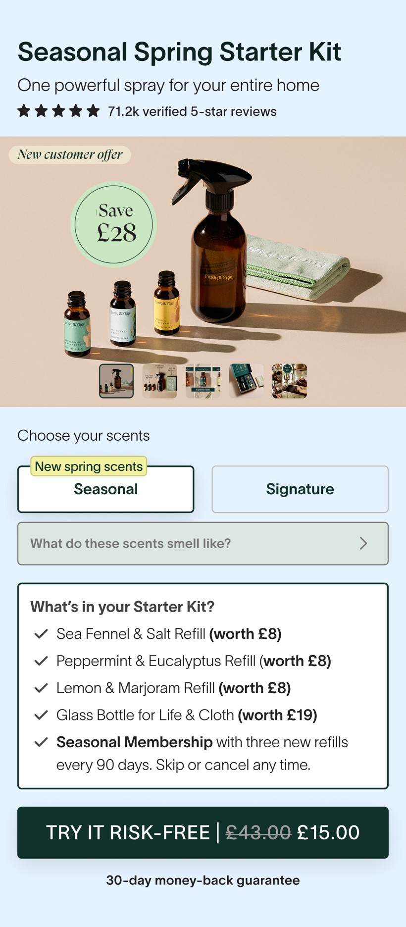
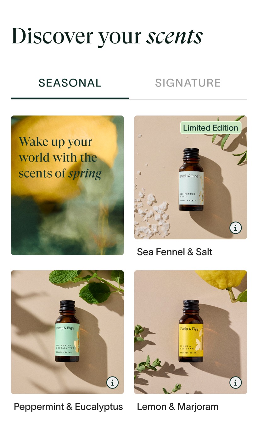
Rather than rearrange the page, I moved scent-discovery up next to the kit selector — where the decision actually happens — and pushed the long blend copy into a popup users can opt into. Three new surfaces, all within reach of the buybox.


PF611 ran as a Split URL A/B test on the Spring Seasonal LP from 9–22 May 2026, 50/50 mobile traffic. Because both windows were the same length on parallel-split traffic, share and per-day click rates are directly comparable. The read: the new scent surfaces route scent-curiosity clicks up toward the decision zone — without cannibalising the path to purchase.
FAQ engagement rose materially (+3.5pp) — users weren't exiting in confusion, they were continuing to research. The duplicate transformational-scents section mid-page lost the equivalent attention (−7.4pp), confirming the "visual disconnect" hypothesis: with scent now near the buybox, users no longer scrolled to find it.
A branding and product-design concept for a community-based waste-management and recycling app in the Philippines — connecting households, barangays, and the women recyclers who power local Materials Recovery Facilities (MRFs).
MARE! (short for Materials Recovery) is a community-focused app that streamlines operations in local Materials Recovery Facilities (MRFs) across the Philippines. It simplifies the collection, sorting, and delivery of recyclables — especially plastic waste — by connecting communities directly with a network of women recyclers. By providing jobs and livelihood opportunities, MARE! empowers these women while driving inclusive environmental impact, and supports barangays with educational campaigns, segregation tools, and ongoing technical assistance.
In many communities across the Philippines, waste segregation and recycling stay inefficient and inconsistent — held back by a lack of education, tools, and systematised processes. Local MRFs rely on manual record-keeping, with little connection between households, barangays, and recyclers. The women who do much of this work remain under-recognised and underused in the recycling economy. The result: recyclable materials end up in landfills or waterways, and livelihood opportunities are missed.
To understand current habits, pain points, and motivations, I ran 8 in-depth interviews with community members, barangay officials, and women recyclers; observed workflows at 2 local MRFs; surveyed 30+ households on recycling awareness and app openness; and reviewed secondary reports on plastic pollution, MRF operations, and women's roles in the sector.
Most communities still rely on pen-and-paper for MRF records.
OperationsResidents are aware of recycling, but most don't segregate their waste due to unclear guidelines and a lack of tools.
BehaviourMany work informally, disconnected from formal recycling networks or consistent job opportunities.
EquityResidents and barangay officials are willing to use mobile apps — if they're simple and clearly beneficial.
OpportunityMisconceptions about recyclable materials are common and hold the whole system back.
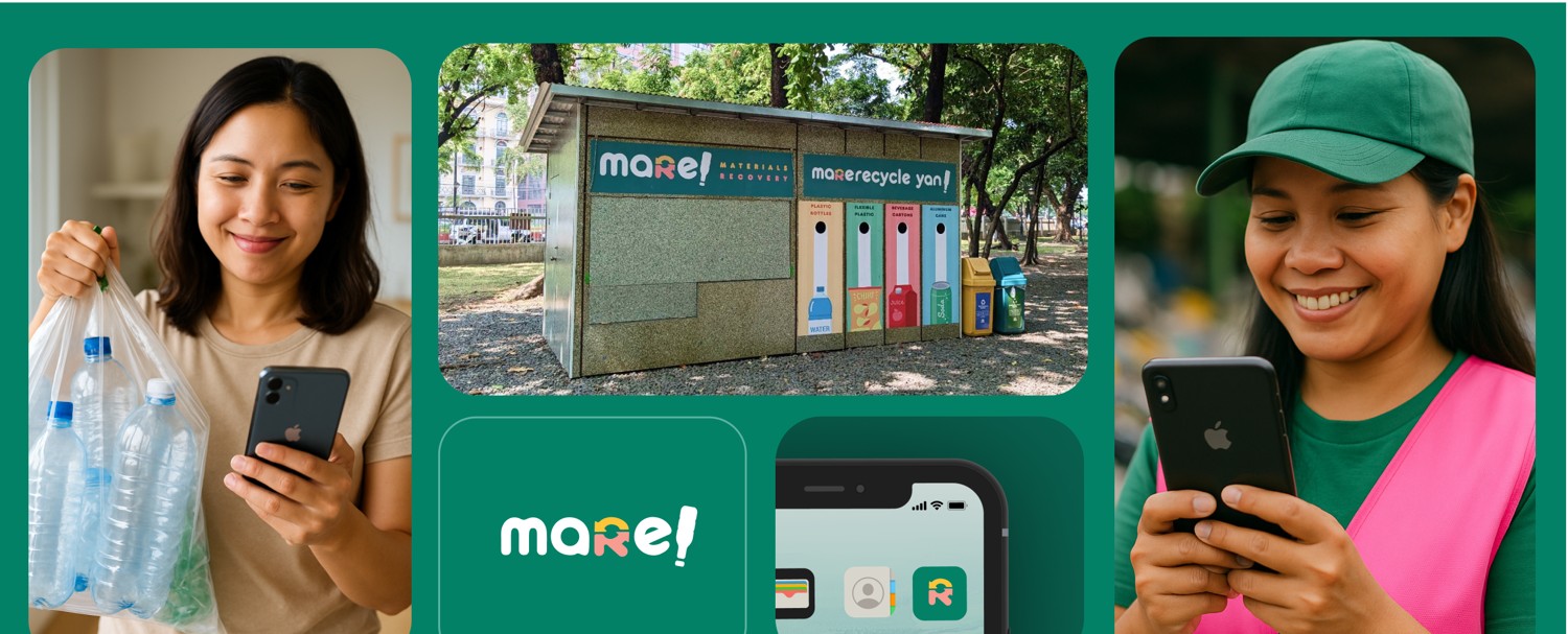
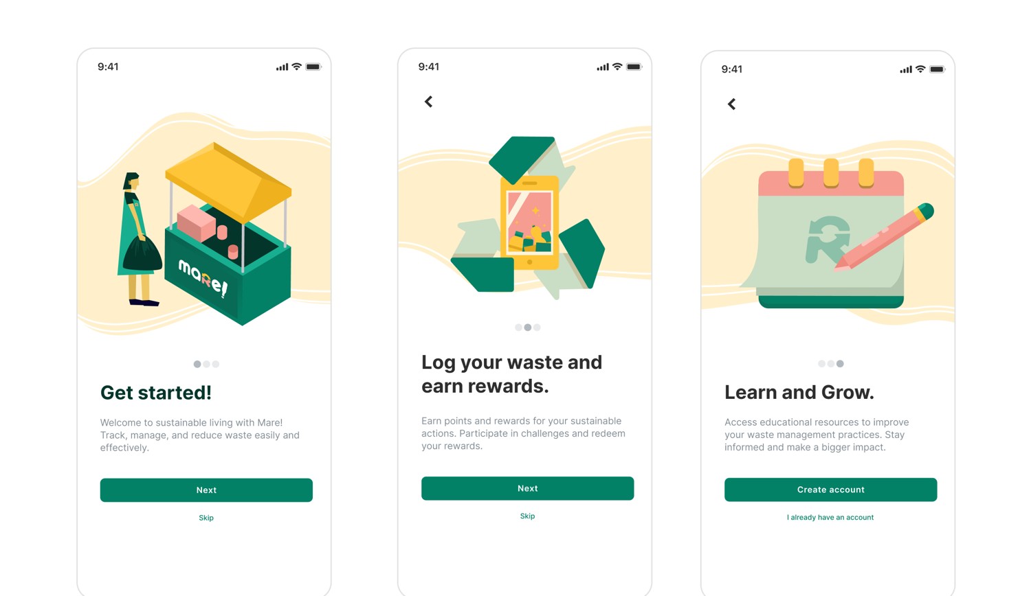
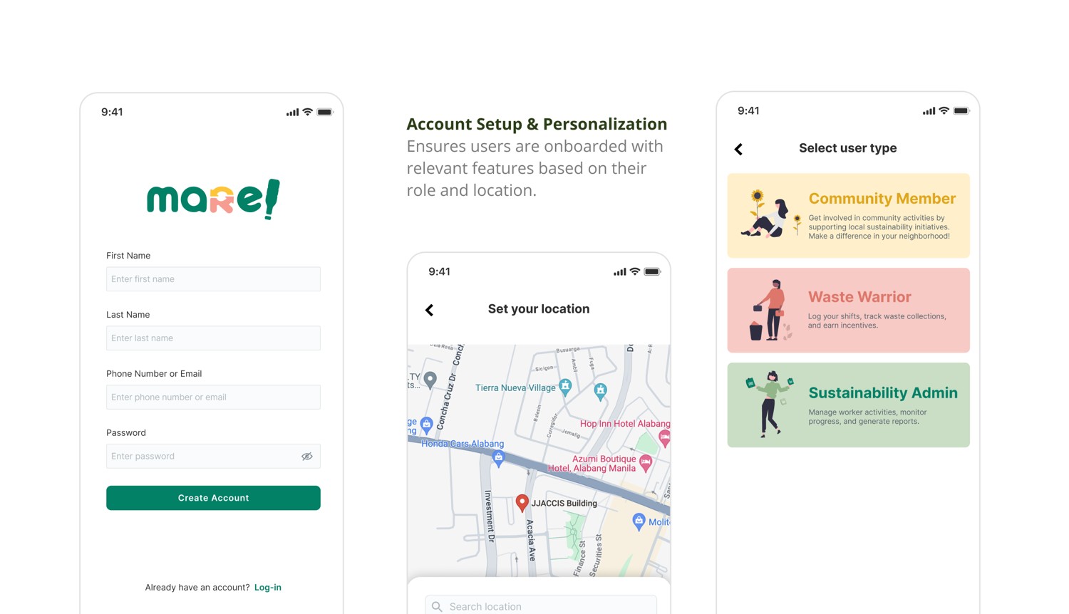
AwarenessMare connects the community around a single recycling loop — Community Members (households), Waste Warriors (women recyclers), and Sustainability Admins (barangay officials). The experience is built to educate, motivate, and coordinate, so responsible disposal becomes the easy, rewarding default.
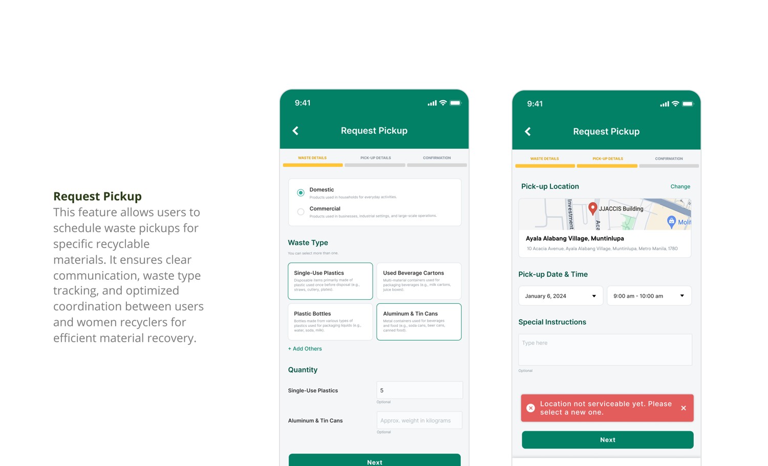
Schedule pickups for specific recyclable materials, with clear waste-type tracking and optimised coordination between residents and women recyclers.
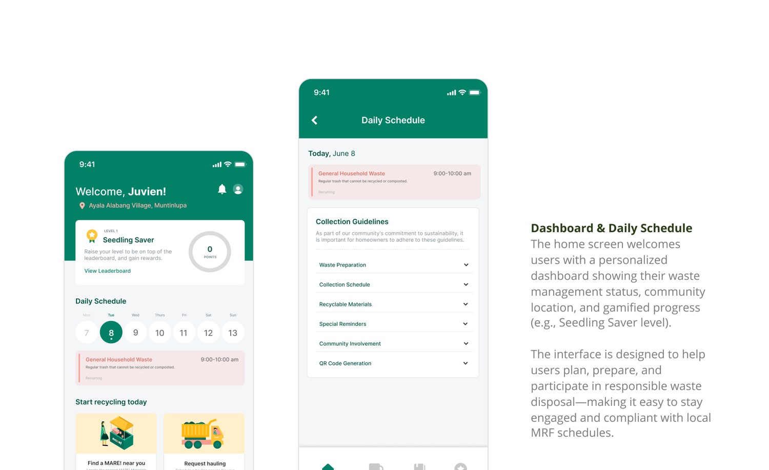
Core flowA personalised home surfaces waste status, community location, and gamified progress (e.g. a "Seedling Saver" level) so people stay compliant with local MRF schedules.
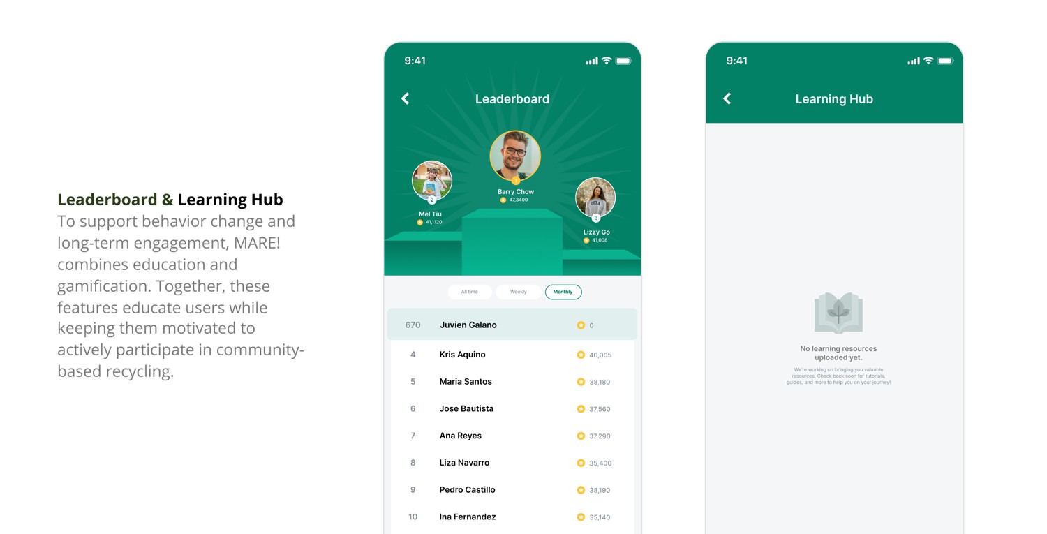
HomePoints, levels, and leaderboards keep users motivated to participate in community-based recycling.
MotivationEducational resources tackle misconceptions head-on and build better long-term habits.
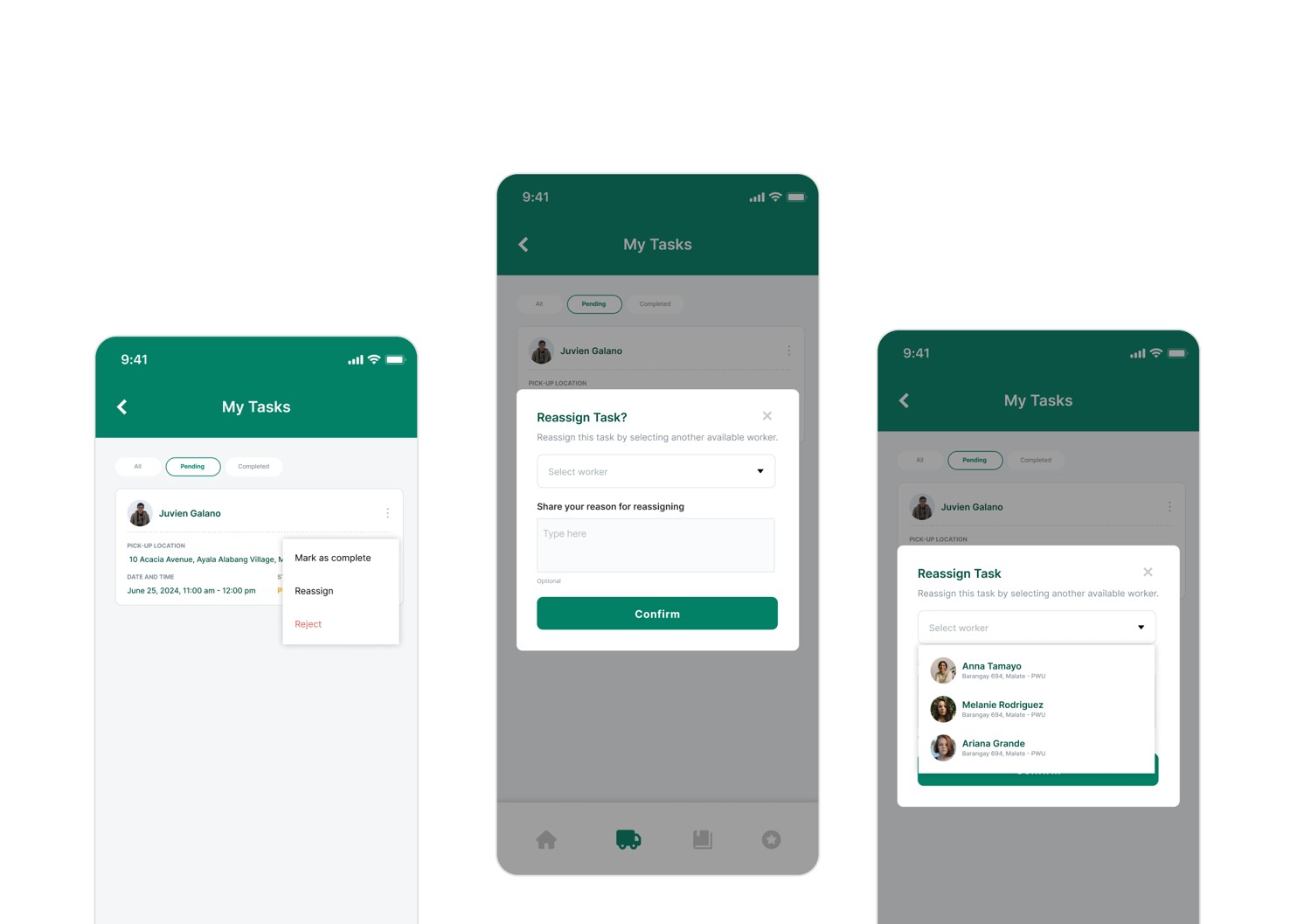
EducationWomen recyclers manage and reassign pickup tasks, giving informal work real structure, visibility, and dignity.
LivelihoodAlongside the product, I built the "mare!" brand and a full design system — typography (TT Commons), components, and a set of custom illustrations. The palette carries meaning as much as mood.
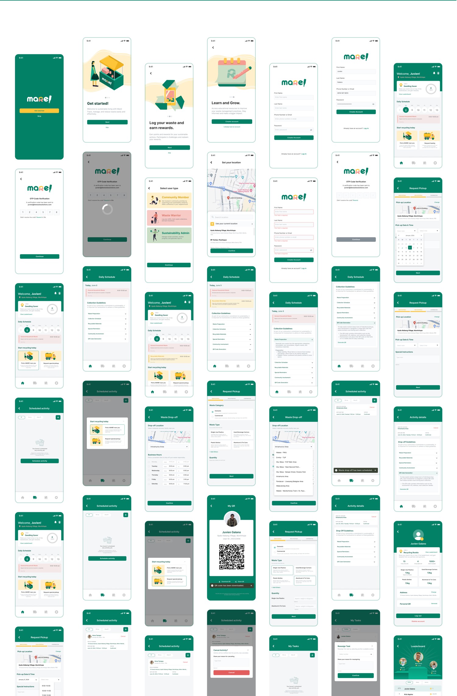
A walk through the key surfaces — from first launch to the recycler's daily tasks.


I’m a Manila-based Product Designer with six years of experience across LegalTech, HealthTech, SaaS, and e-commerce, combining research, strategy, and conversion thinking to make complex products feel clear and intuitive.
My work spans the full product lifecycle—from defining problems and mapping user flows to prototyping, building design systems, collaborating with developers, and learning from post-launch behaviour.


| Stage | Type | Key question | Status |
|---|
| Category | Artifact | Purpose | Related stage |
|---|
Some ideas deserve a second chance. Others are final_final_ACTUAL_v12.fig.
Open it on your laptop or desktop for the full experience — it's worth it.